

Problem
Construction projects generate chaos, not just buildings. Teams contend with scattered communication (texts, chats, word-of-mouth), heavy manual admin after long shifts, no real-time visibility into schedules, and delayed logs and expense reports—making accurate tracking and coordination nearly impossible.
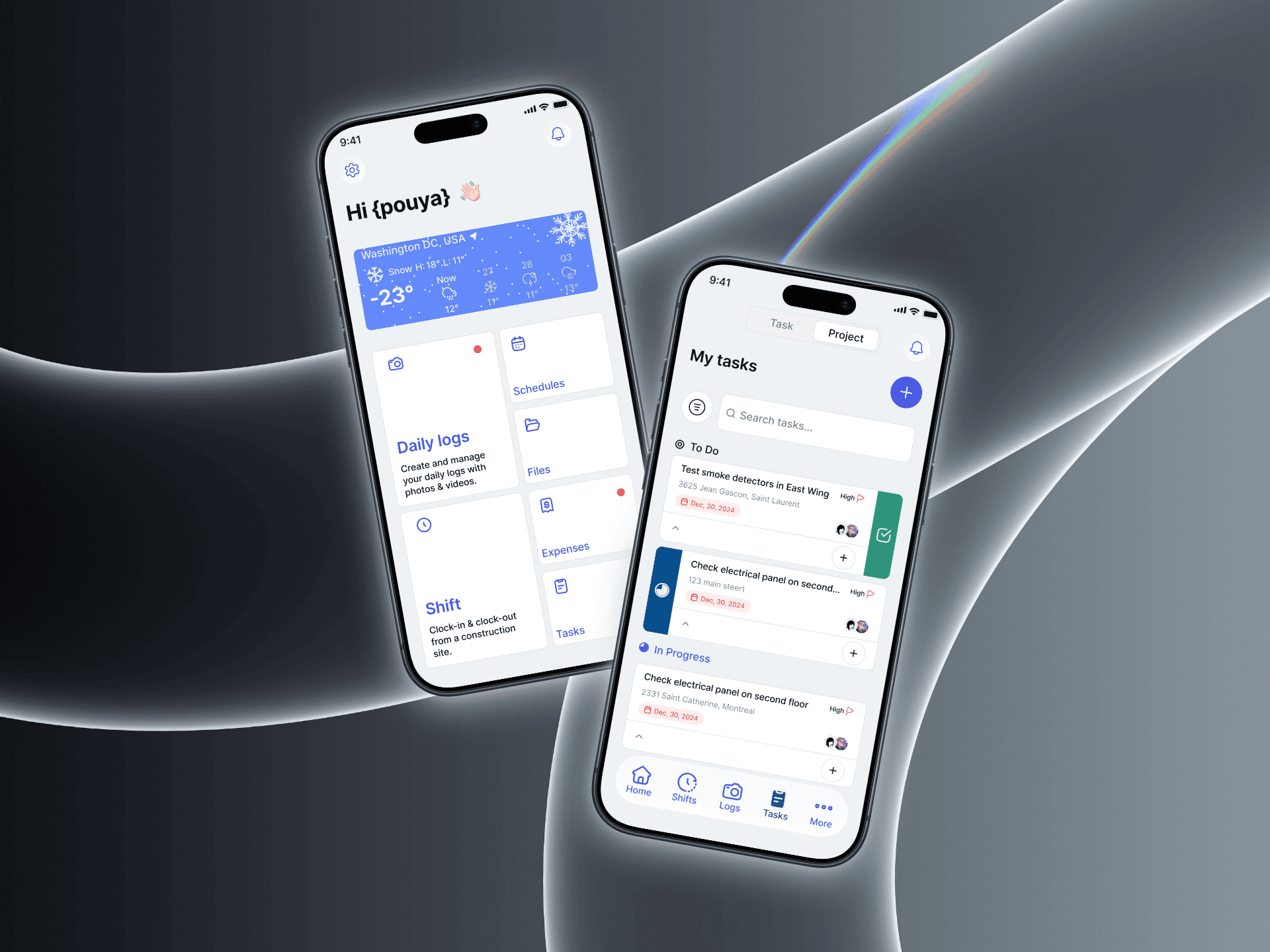
The existing PWA dashboard offered limited capability, and its weak hierarchy and dense layouts made task management and shift management difficult to interpret in everyday use.

Research
Looking beyond speculations
To better understand where friction appeared across the dashboard, I reviewed current workflows and conducted user interviews with people regularly managing projects and in-field workers. The research focused on how users scanned information, created tasks and shifts, and navigated everyday tasks across the interface.
What we learned
Designing for deskless and frontline workers is fundamentally different from designing for office based users. The context of use changes everything, people are on the go, often on active job sites, glancing at their phone between tasks rather than sitting at a desk.
Through interviews and workflow analysis, I identified recurring patterns in how users reviewed tasks, tracked shifts, and navigated everyday tasks. The biggest issue wasn’t complexity itself, it was uncertainty. Users often stopped to clock-in shifts, reopen shift and tasks details, or rescan multiple sections before taking action. Similar visual weight across the interface made it difficult to quickly identify what mattered most.
The users were General Contractors, their workers, and subcontractors operating on construction sites, not desk workers, so I had to design for real world constraints: small screens, one handed use, noisy environments, and workflows that needed to be completed quickly and without confusion. Every screen had to earn its place. I focused heavily on task clarity, reducing cognitive load, and making the most common actions immediately accessible without deep navigation.
The triage and discovery phase was critical here. I spent time understanding how GCs and their teams actually move through their day on site, what information they need at a glance versus what can be secondary, and where the existing process created friction. That shaped the information architecture and interaction model from the ground up.
Ideation
Exploring directions
With a clearer picture of how General Contractors and their crews actually move through a job site, ideation focused on turning research insights into concrete directions. The goal wasn’t to add features — it was to reduce uncertainty and make the most common actions obvious at a glance.
I sketched a range of layouts for the dashboard, task, and shift flows, exploring how to establish a stronger visual hierarchy so that priority tasks, active shifts, and next steps stood apart from secondary details. Early concepts pushed toward a glanceable, mobile-first structure — large touch targets, one-handed reach, and shift actions like clock-in surfaced directly instead of buried in nested screens.
Rather than committing to a single idea, I mapped several competing directions against real on-site constraints: noisy environments, quick context switches, and the need to complete tasks without confusion. Testing these low-fidelity concepts on actual devices helped me narrow down to the patterns that felt fastest and most intuitive in the field, and those became the foundation for the design decisions that followed.


Design
Design system and prototyping
As per Billdr had no existing design system in place, and with a mobile app on the horizon, we needed a foundation that could scale to web without starting over. After thorough research and several rounds of cross-functional discussion, we aligned on a cross-platform strategy, adopting React Native Reusables as our component foundation and anchoring the system to shadcn/ui, adapting its primitives to fit our specific product requirements. This gave us a scalable, consistent token architecture that bridged mobile and web without maintaining two separate systems.

Trio ideation gave us the space to ask "what if" before asking "what's feasible." Freed from technical and scope constraints, the most compelling concept that surfaced was a voice agentic flow where workers could dictate tasks on the go rather than navigating a form. For a construction workforce that's often hands-on and time-pressured on site, this wasn't just a novel idea; it was the most human-centered solution in the room.

With the flow logic validated through wireframes, we moved into MVP version of high-fidelity prototyping to bring tasks, projects, and schedules to life with real components from our design system. This phase also forced a critical conversation around scope: not everything that emerged from ideation belonged in v1, so I worked closely with the team to define clear boundaries around what to build first, keeping the prototype focused and shippable. This was where the token architecture paid off too; screens came together faster and stayed visually consistent without manual effort. Interactive prototypes were then used to run usability sessions with workers on site, giving us behavioral signal we couldn't get from static screens alone.

Lessons
The product is still in active development, but early prototype showcases with a select group of customers and real users have already validated the direction. The feedback has been consistently positive, what stood out most was how quickly people could get to what they needed, with minimal friction and no hand-holding. For a workforce that isn't always comfortable with digital tools, that ease of reaching the goal was exactly what we designed for and hearing it reflected back from real users made it clear the approach was right.