

Context
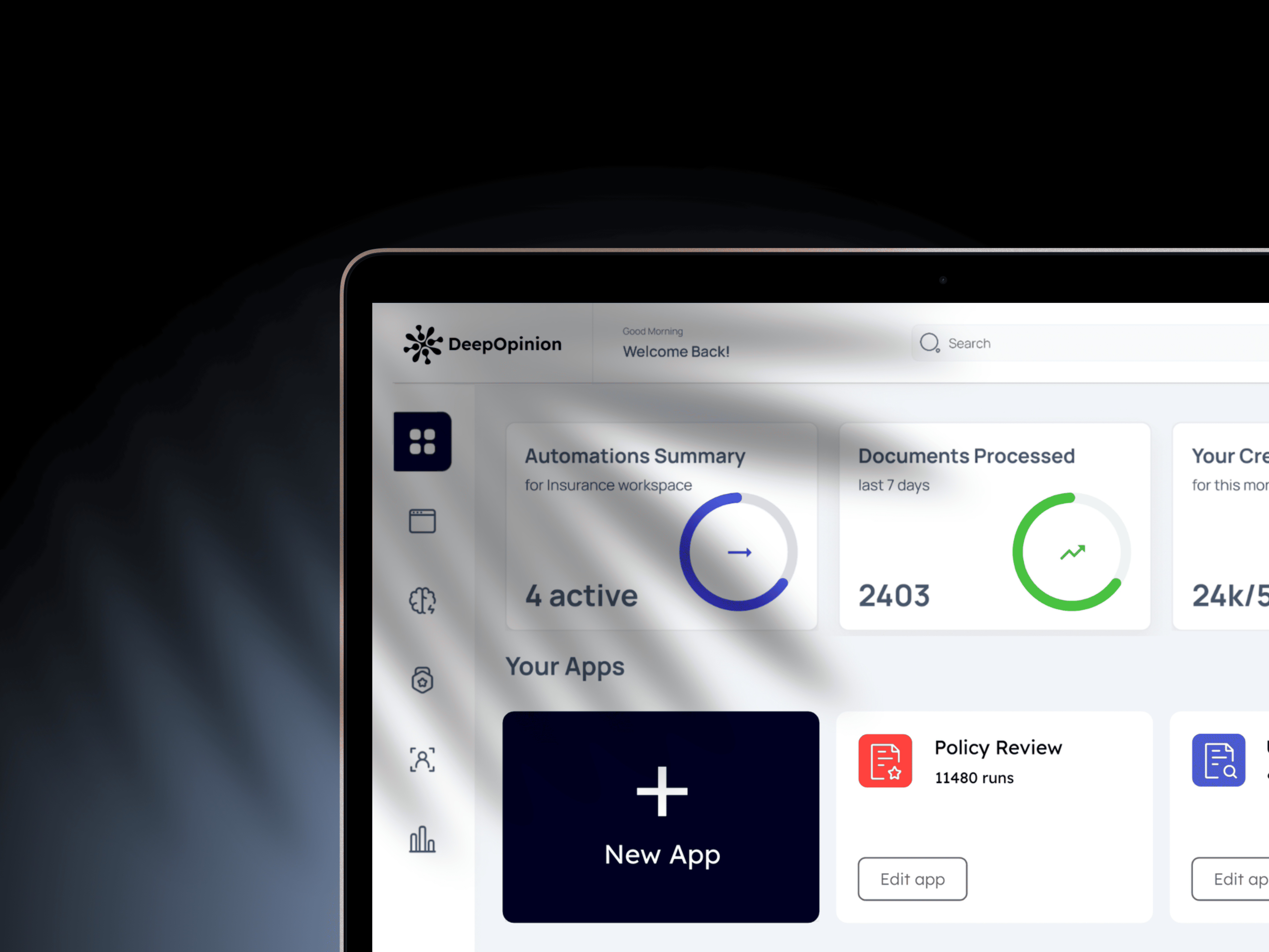
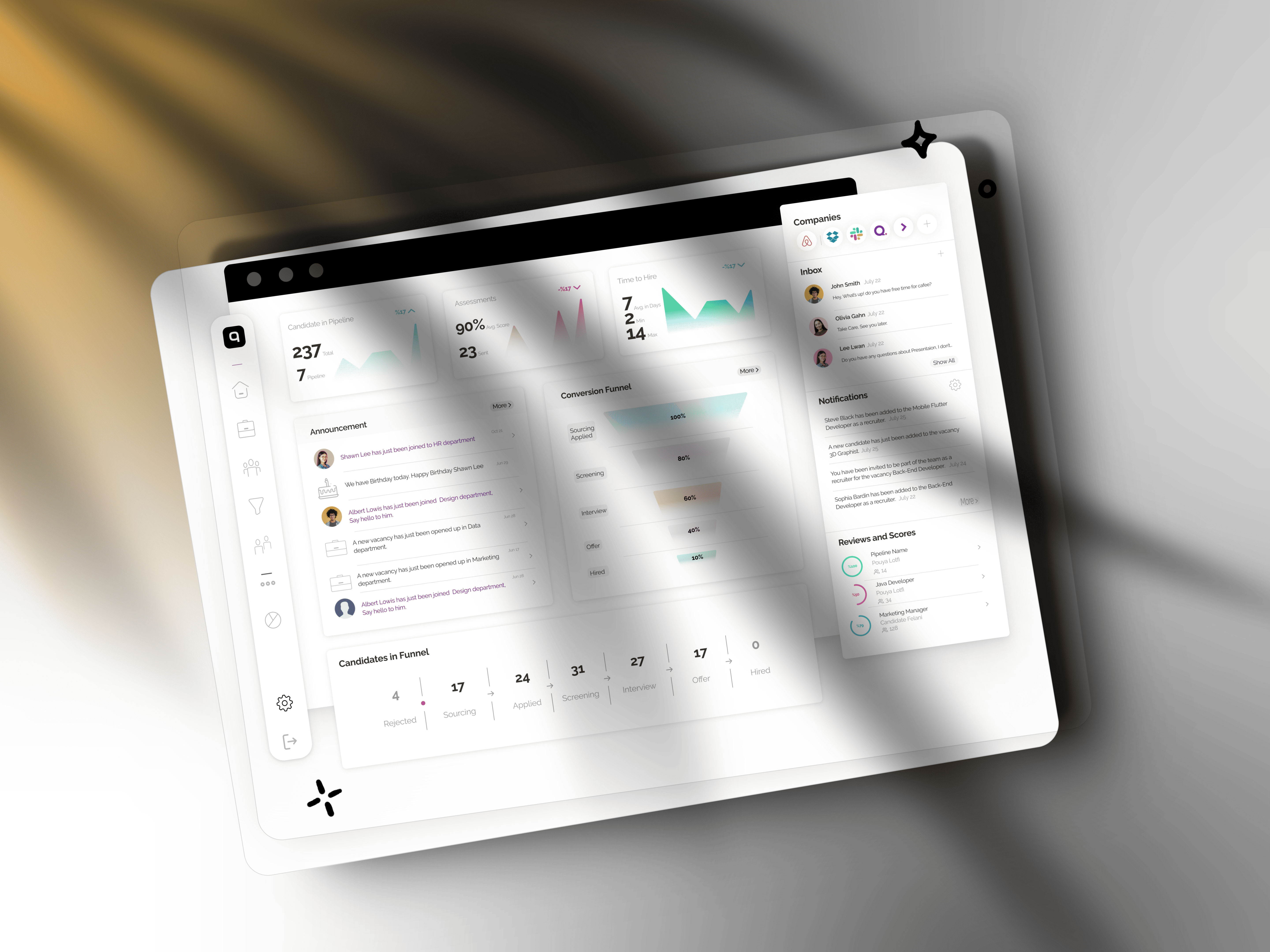
NexScale was at an inflection point. Despite operating at the intersection of AI and boutique fitness, the team was struggling to carve out a clear category within the emerging agentic operations space, one where gym studios and recreation centers could see themselves reflected. The market was noisy, and the product vision kept drifting between tool and platform, between assistant and automation. It wasn't until findings from an automation agency engagement surfaced a sharper truth: studio operators didn't want another dashboard to manage. They wanted someone to handle the work. That insight reframed everything. NexScale wasn't building software for fitness businesses, it was building the first AI operator for them, a category that didn't yet have a name but had an unmistakable demand hiding in plain sight.
Goal:
To design and build an agentic retention platform for gym studios.
Continuous Improvement: Provide a framework for ongoing enhancement of chatbot responses and user interaction.
My Role
As Lead Product Designer, I:
Led ideation and concept development with the founder
Created and iterated on designs from wireframes to high-fidelity mockups
Collaborated closely with engineering and product management
Iteration
In age of faster delivery, we determind to empower our team intuition (educated guesses), to design and prototype fast.

Onboarding
Seven steps, and a live CRM at the end of them.
Signup is not the hard part. Connecting somebody else's CRM is. The flow had to carry a non technical owner from a cold landing to an authenticated integration without ever leaving them unsure what happens next, so every step states what it needs, why it needs it, and what is left.
After a consensus with engineering and product considering contains, timeline and minimum lovable user path, we agreed upon a registration path.
I designed the sequence for web and mobile in parallel rather than adapting one to the other, because the person who signs up at a desk is often not the person who finishes the setup between classes.

I designed the sequence for web and mobile in parallel rather than adapting one to the other, because the person who signs up at a desk is often not the person who finishes the setup between classes.
One flow, two canvases
Desktop and mobile were mapped as separate boards under the same step headers, so engineering could read a step across both widths without hunting. Click either board to open it full size.


I designed the sequence for web and mobile in parallel rather than adapting one to the other, because the person who signs up at a desk is often not the person who finishes the setup between classes.
States, not just screens
The board carries the parts that decide whether an owner finishes: taken email, weak password, expired code, a wrong API key, plus the reminder that goes out four days after signup to somebody who registered and never subscribed. A second branch covers a staff member who logs in to an account they did not create.


Dashboard
A read on the business in the time it takes to drink a coffee.
Operators do not sit with analytics. They check between classes. So the dashboard opens on what needs attention today and only then offers the depth: a monthly executive summary, member health, and how the room actually feels.
Every view keeps an Ask Chloe entry point in reach, so a number is never a dead end. All figures shown here are sample data.
Conversation
The blank field is the hardest screen in the product.
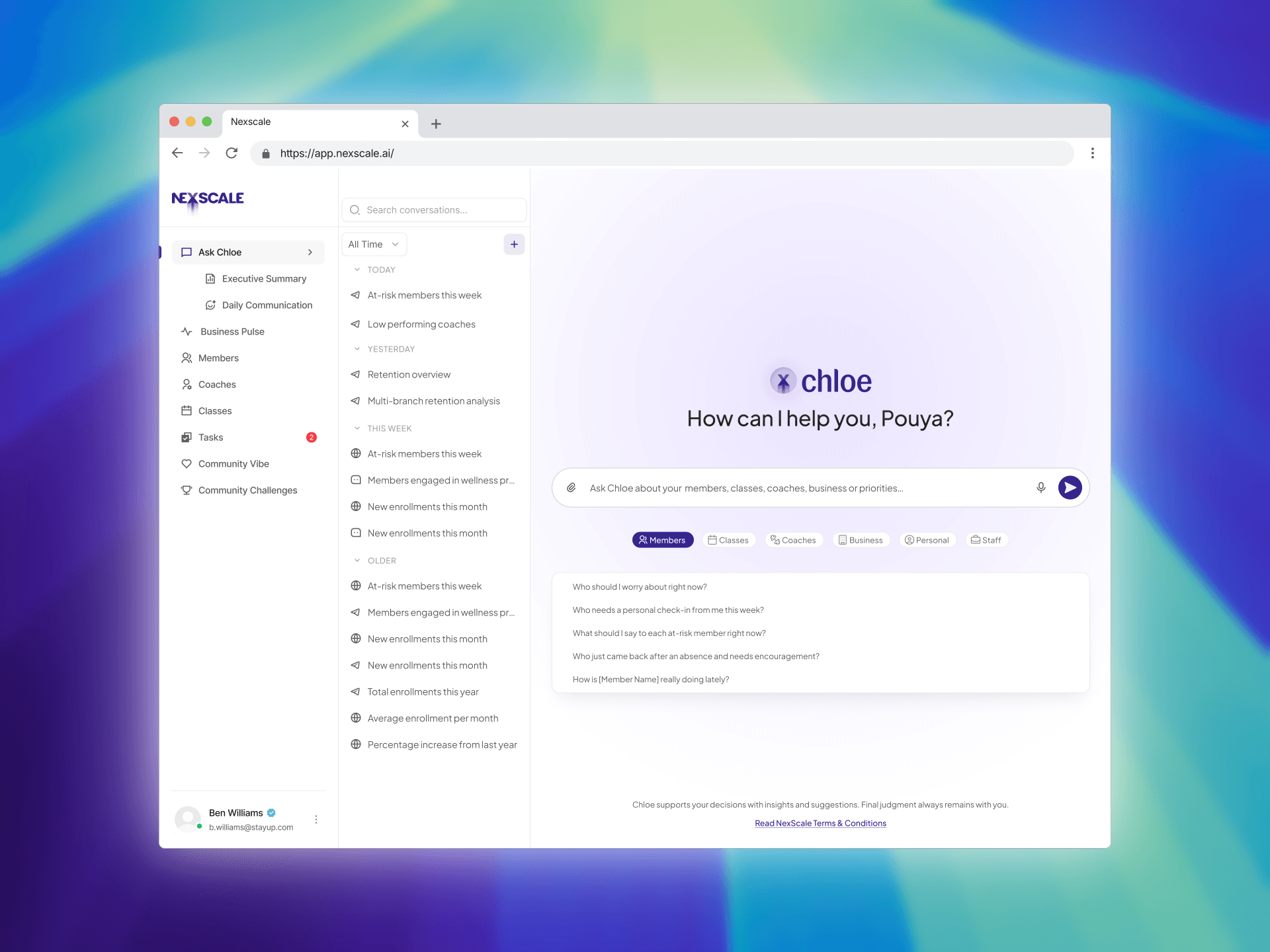
An open prompt tells a studio owner nothing about what the thing can do. The home state answers that with real questions from their own week, scoped by channel and by time, so the first message is never a guess.
Long analysis gets a visible working state and returns as a document rather than a wall of chat, since that is what gets acted on and shared.
Ask Chloe
Prompt starters grouped the way an operator thinks: members, classes, coaches, business, personal, staff.
History grouped by today, yesterday, this week, older
Channel and date filters sit with the thread list, not the composer
A standing line that Chloe supports decisions and the owner makes them

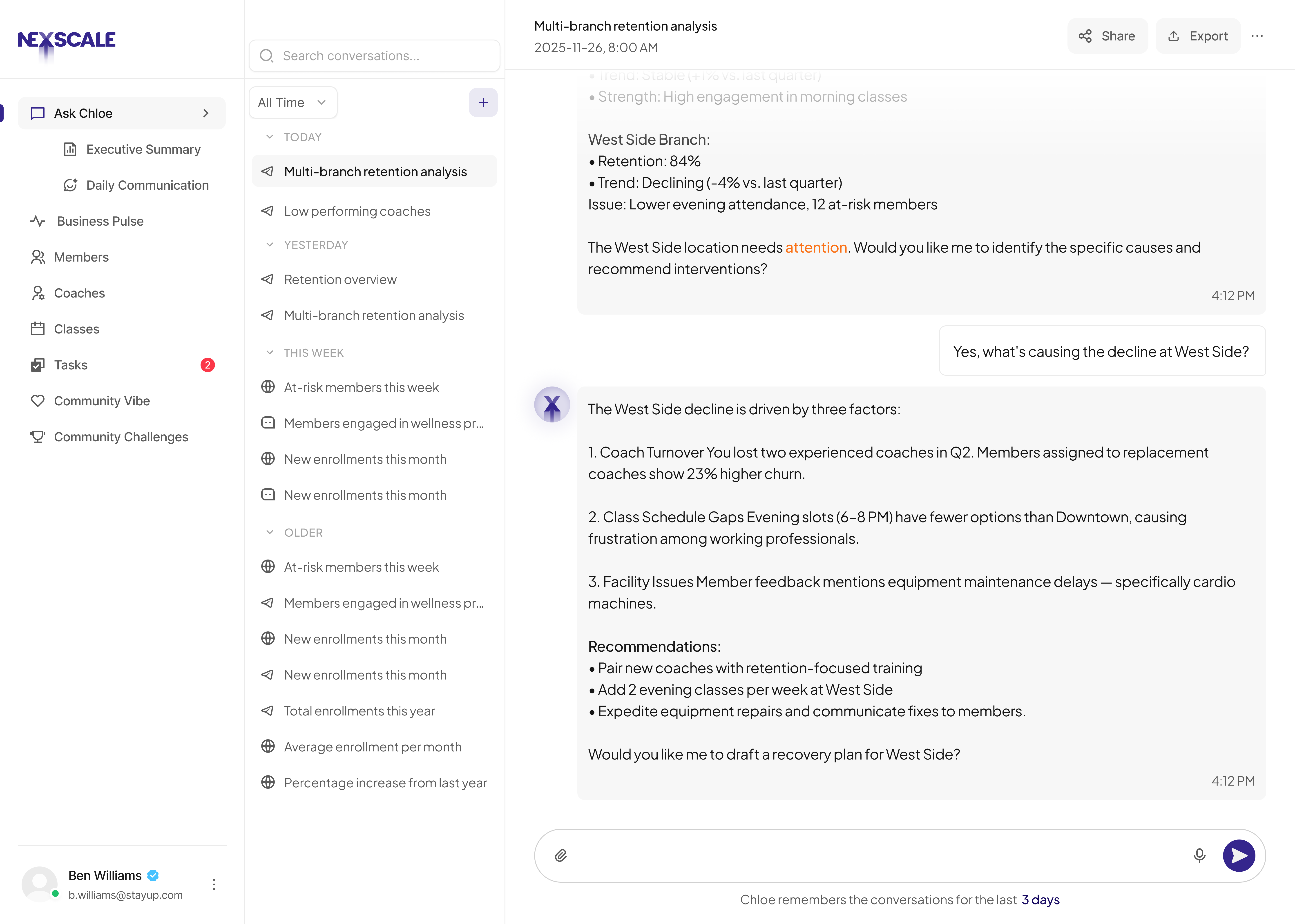
Multi branch analysis
A real request from an owner with more than one location, asked in one long sentence.
The thinking state names what is happening instead of spinning
Results title themselves, so the thread stays findable later
Export sits in the header, next to the thread, not at the end of the answer
Executive Summary
The monthly document an owner forwards to a partner or an accountant. Overview in sentences, metrics underneath, in that order Each finding pinned to a recommended action Copy and export as PDF, because it leaves the product

Business Pulse
The landing view. Today's focus first, then the counts an owner recognises. Active, at risk and churned members as three plain cards Total visits, new sign ups, visits per active member An empty state that reads as reassurance, not as absence

Community Vibe
Retention in a studio is social. This view gives sentiment the same standing as revenue. Health broken down by culture, coaching, scheduling, front desk, cleanliness VIP, regular and new members quoted separately, since they leave for different reasons Trend arrows that say which way, not just how much

Craft
Words as design material
Words as design material
I wrote the interface copy alongside the layouts: error and validation messages, verification and activation emails, empty states, toasts, and the daily brief voice. The rule was plain verbs and one job per line. An empty inbox says you are all caught up and then says what will happen next, because an owner reading it at 6am wants to know whether to worry.
Design system
Most of what slowed us down wasn't taste, it was systems debt. Percent signs missing on one row, trends carried to two decimals, nav that shifted between screens. That's what happens when screens get built one at a time. A real table component, a badge with fixed variants, and one type scale close all of that off at the source.
I'm keeping table, sorting, and row actions distinct from the start, because that's where data heavy screens usually get muddy. Two things I'm watching.
Untitled is a generic SaaS kit, so the parts that make Chloe feel like Chloe (the insight panel, Today's Focus, sentiment rows, chat recommendations) stay ours to design on top. And I'm mapping tokens first, not last. Chloe's purple, the status colors, the lavender panel background all land in Untitled's semantic slots before anything gets built. I also need to pick one source of truth for tokens, Figma or the shadcn work, or we'll be maintaining two definitions of the same purple.
My sequence: tokens and type scale, then table, badge, button. Members List as the pilot since it's the most table heavy, then Business Pulse. Community Vibe last, it has the most custom composition.