Analysis and Planning
Audit
I went through the live site section by section and wrote up every issue against the element it belonged to, rated by severity, so the team could triage rather than debate. The pattern underneath most of it was the same: the site described a mission and never showed a product.
From diagnosis through to shipped pages
I owned this end to end, starting with the argument for why the site needed changing rather than a set of screens nobody had asked for.
Audit
Reviewed the live site section by section on desktop and mobile, checking content currency, accessibility, information architecture and asset hygiene alongside the visual work.
Critique document
Wrote up twenty one findings as an annotated document, each pinned to the section it lived in and rated critical, major or minor, so the team could triage instead of debate taste.
Roadmap
Sorted every finding into this week, this month and next quarter, separating the five minute fixes from the ones that needed a decision about positioning.
Positioning
Rewrote the page around a concrete offer, defined what Chloe actually does for an operator, and resolved three competing product names into one.
Design and build
Redesigned the page structure and visual direction, moved the marketing site to a light theme, and shipped it on the production domain.
Tweak and Adjust
Adjuted the color, style, content and interaction based on the founder request.
What changed
Five decisions did most of the work
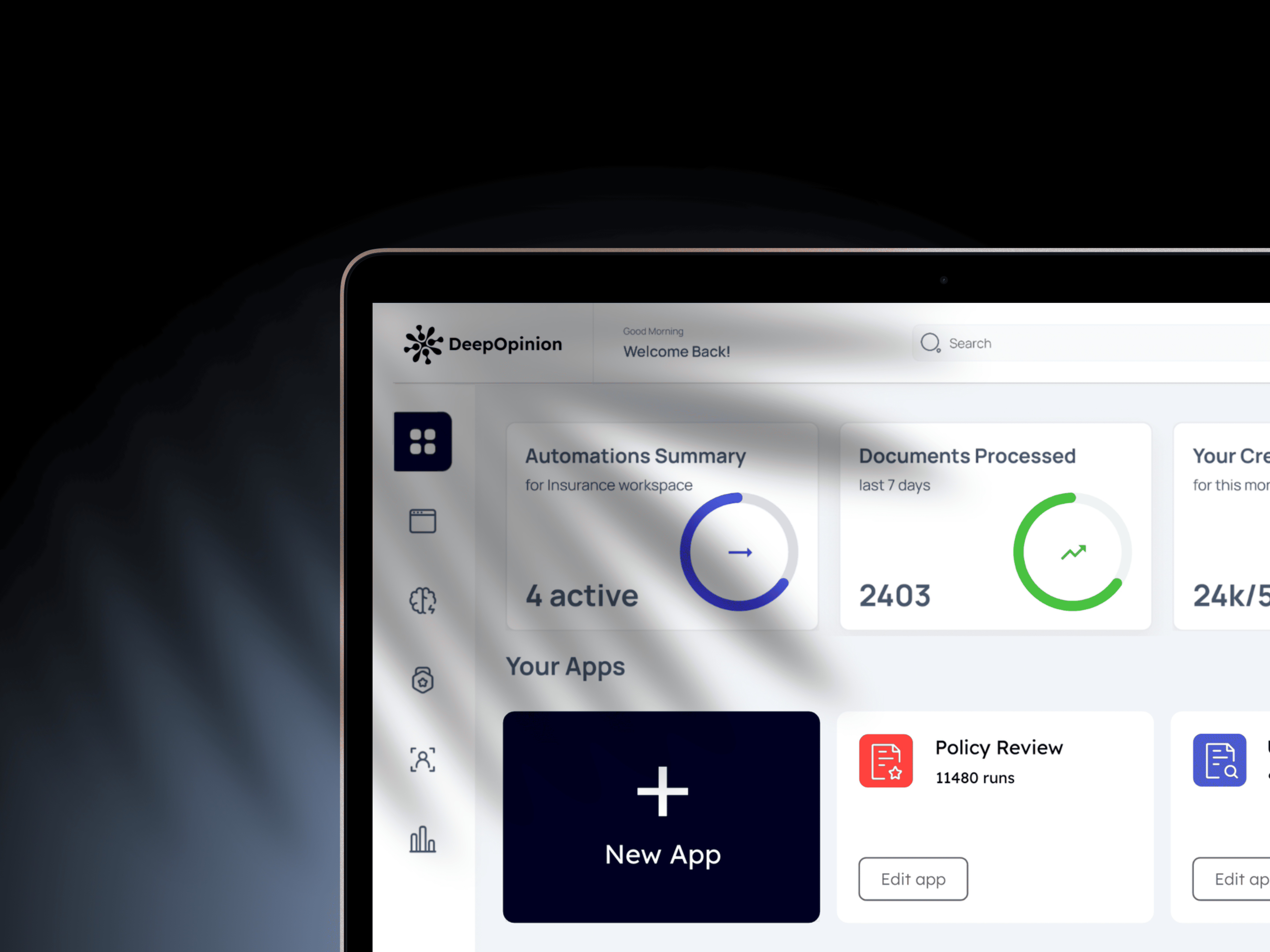
Operators do not sit with analytics. They check between classes. So the dashboard opens on what needs attention today and only then offers the depth: a monthly executive summary, member health, and how the room actually feels.
Every view keeps an Ask Chloe entry point in reach, so a number is never a dead end. All figures shown here are sample data.
An offer, not a mission
The hero now names the thing an operator is already worried about, and Chloe is explained on the page that announces her. Was: a longevity mission statement, with three competing names for the product and no description of what the software does.
Light, because the reader is
The marketing site went light and warm to match how studio owners read it, on a phone between classes. Dark stayed where it earns its keep, in the product UI at 6am. Was: dark canvas, glow and 3D chrome, the grammar of developer tooling aimed at a non technical buyer.
Roadmap
Sorted every finding into this week, this month and next quarter, separating the five minute fixes from the ones that needed a decision about positioning.
Proof above the fold
Outcome numbers and named operator quotes sit high on the page, close to the claims they support. Was: "Proven to Drive Growth" with no metric, no screenshot and no named studio anywhere on the page.
One story, one call to action
Duplicate sections merged into a single narrative, and every path ends at the same action with the same label. Was: two sections repeating one promise verbatim, and five CTA labels in three casings pointing at one form.
One source of truth
The site moved onto its own domain with current content and no unpausable motion, which cleared a WCAG 2.2.2 failure at the same time. Was: an expired event promoted in three places, three overlays before any content, and every internal link on a preview domain.
Before and after
Same thesis, said from the operator's side
Reflection
The craft ceiling was never the problem
Almost nothing on the finding list needed a redesign. The visual system was already good enough. What was missing was a single content source and the willingness to show the product, and most of the critical items were maintenance debt rather than design decisions: a stale event, a misspelled advisor name, a preview domain in production. The lesson I took: auditing before redesigning changes what you argue for. Walking in with twenty one findings sorted by severity turned the conversation from taste into triage, and the team shipped the first five fixes the same week.